Responsive Website Design in Los Angeles: Ways It Benefits You
Responsive web design, mobile optimization, no matter what you call it, it’s necessary for your business. No matter what industry you’re in or how long your business has been around, the only way your company can grow is with a responsive website. As a company that offers responsive website design in Los Angeles, we’ve helped many businesses to have the caliber of website that enables their business to grow today as well as tomorrow.
Below, we touch on some of what responsive websites are and why they’re so crucial. If you have any further questions, don’t hesitate to reach out for a free consultation.
Why is Responsive Website Design So Important for Businesses?
The way people access the internet has changed dramatically over the years. Gone are the days when desktops were the primary devices for browsing the web. Today, users rely on a variety of devices, including smartphones, tablets, and laptops, to access websites.
In fact, mobile devices account for over half of all web traffic globally. This shift in user behavior has made responsive website design a necessity for businesses that want to stay competitive.
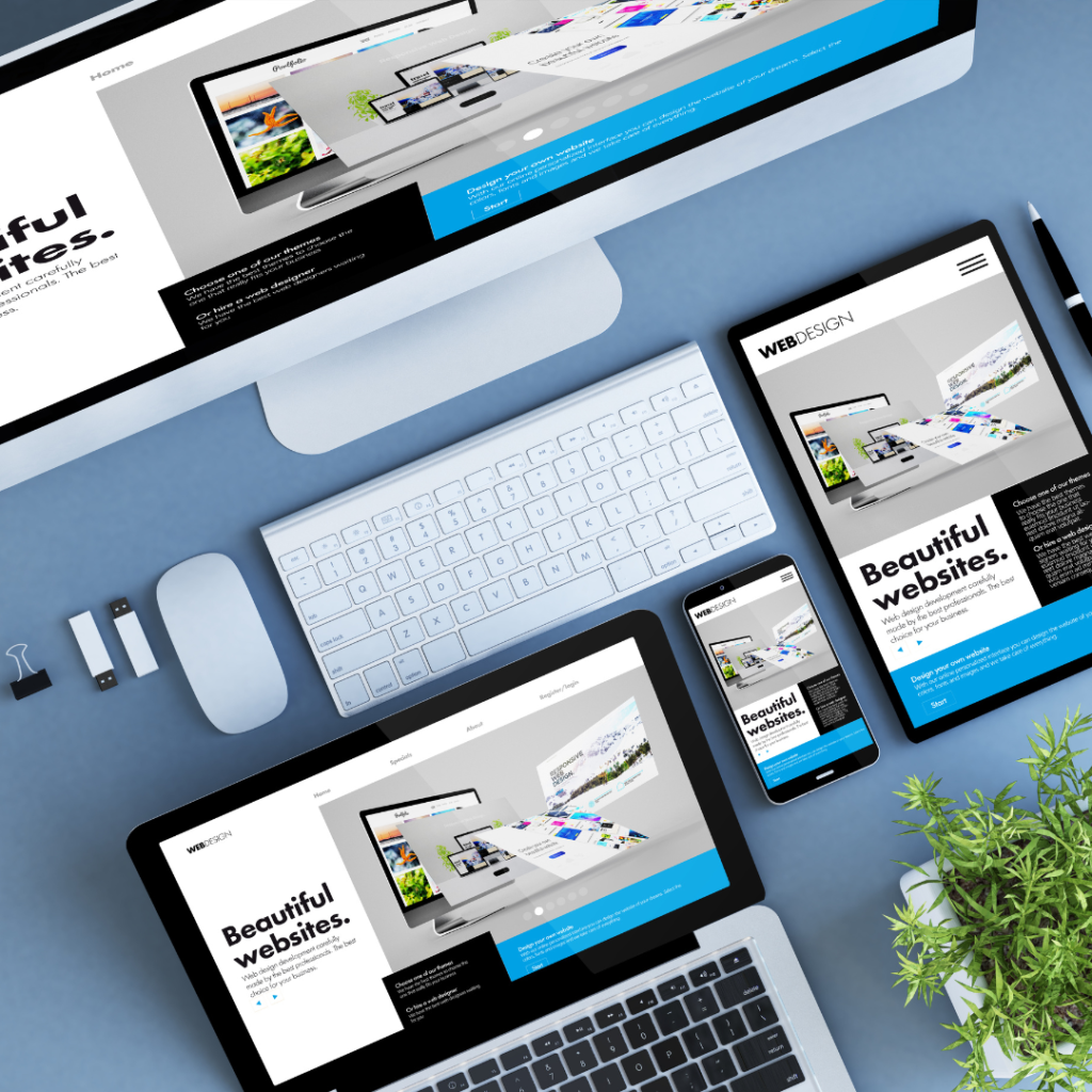
A responsive website adapts seamlessly to different screen sizes and devices, ensuring that users have a consistent and enjoyable experience no matter how they access the site.
What is Responsive Web Design?
Responsive web design is an approach to web development that focuses on creating websites that automatically adjust their layout, images, and content to fit the screen size of the device being used.
This means that whether a user is viewing the site on a 27-inch desktop monitor or a much smaller smartphone, the website will look and function perfectly.
The key elements of responsive web design include any number of attributes, such as flexible grids, fluid images, CSS media queries, and more. Together, these elements ensure that the website delivers an optimal viewing experience across all devices.
For businesses, this means no longer needing to maintain separate websites for desktop and mobile users. A single responsive website can cater to all users, simplifying maintenance and reducing costs.
Provide a Better User Experience (That’s Also Better for Search Engines)
A site that is difficult to navigate, slow to load, or poorly optimized for mobile devices can frustrate users and drive them away. On the other hand, a responsive website provides a smooth and intuitive experience that keeps users engaged. User experience (UX) is a critical factor in the success of any website.
When users can easily find the information they need and navigate the site without hassle, they are more likely to stay longer and explore further. This positive experience can lead to higher conversion rates, whether the goal is to make a purchase, fill out a contact form, or sign up for a newsletter.
But, the benefits of responsive web design extend beyond user satisfaction. Search engines like Google prioritize websites that offer a great user experience, especially on mobile devices.
By investing in responsive website design, businesses can improve their chances of ranking higher in search engine results, driving more organic traffic to their site.
Lower Your Bounce Rate While Boosting Your SEO Rankings with Website Design in Los Angeles
A high bounce rate can indicate that users are not finding what they are looking for or that the site is not user-friendly. Responsive web design can help lower bounce rates by ensuring that users have a positive experience from the moment they land on the site.
When a website is responsive, users are less likely to encounter issues like distorted layouts, unreadable text, or broken links. Instead, they are greeted with a clean, functional design that encourages them to stay and explore. This not only reduces bounce rates but also signals to search engines that the site is valuable and relevant, which can boost SEO rankings.
For just about any business in any industry, a lower bounce rate and higher SEO rankings can make a significant difference. It can mean the difference between being buried on the second page of search results and appearing at the top, where potential customers are more likely to find you.
A Marketing Company That Can Do More Than Just Design Responsive Websites
While responsive web design is a critical component of a successful online presence, it is just one piece of the puzzle. To truly stand out in a crowded market, businesses need a comprehensive digital marketing strategy that includes SEO, content marketing, social media management, and more.
Here at Website Depot, we provide the kind of website design in Los Angeles that empowers businesses to grow how they want to grow. Moreover, as a full-service digital marketing company, we understand that a great website is only as effective as the strategy behind it.
As such, we work closely with clients to create customized solutions that drive results. To see how we can help you, schedule a free consultation.
Responsive Website Design in Los Angeles FAQs
1. Why is responsive website design important for businesses?
Responsive website design is crucial because users now access the internet from various devices, including smartphones, tablets, and laptops. Over half of global web traffic comes from mobile devices, making it essential for businesses to provide a seamless experience across all screen sizes.
A responsive website ensures users have a consistent and enjoyable experience, helping businesses stay competitive.
What is responsive web design?
Responsive web design is an approach that creates websites capable of automatically adjusting their layout, images, and content to fit the screen size of the device being used. This ensures the site looks and functions perfectly on any device, eliminating the need for separate desktop and mobile websites.
How does responsive design improve user experience and SEO?
A responsive website provides a smooth, intuitive experience, reducing frustration and keeping users engaged. This leads to higher conversion rates and longer site visits. Additionally, search engines like Google prioritize mobile-friendly websites, so responsive design can improve SEO rankings and drive more organic traffic.
Can responsive design lower bounce rates and boost SEO?
Yes, responsive design helps lower bounce rates by ensuring users have a positive experience from the moment they land on your site. A clean, functional design minimizes issues like distorted layouts or unreadable text, encouraging users to stay longer. This signals to search engines that your site is valuable, potentially boosting your rankings.
Does Website Depot offer more than just responsive website design in Los Angeles?
Absolutely. While responsive web design is a key service, Website Depot offers comprehensive digital marketing solutions. From SEO and content marketing to social media management, we create customized strategies to help businesses grow and achieve measurable results. Reach out for a free consultation.