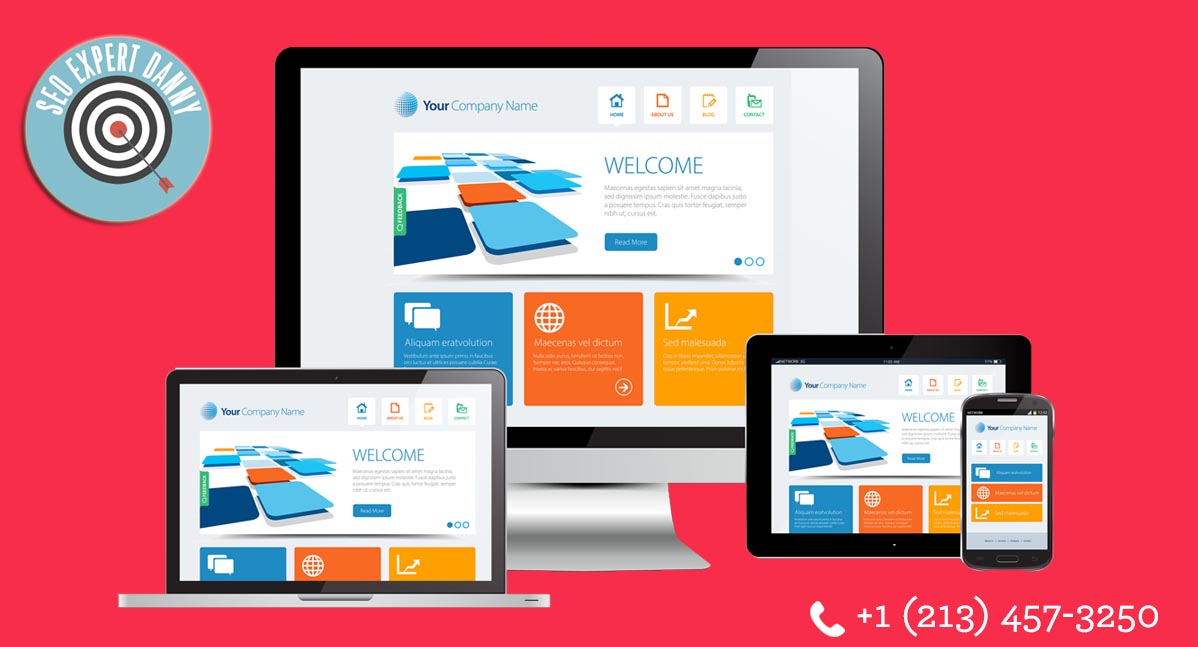
Using Web Design to Boost eCommerce

This year, we can expect the eCommerce design to change again. The biggest changes involve how the platforms are designed to boost online sales.
In this post, let’s show you the trends in eCommerce design and how you can improve your sales online.
Flat Design
One of the biggest design trends for eCommerce is flat design. Introduced in 2014, flat design has attracted major designers. The style includes a series of simple colors, lines, and shapes. Its primary goal here is to create a site that’s entirely clean. It also uses a minimal amount of glitter.
Nowadays, designers are adding another element to a flat design — material design. It involves adding of colors to entice more users to shop.
Although material design needs additional colors, it still follows the psychology of color. That is the color chosen should create the true effect.
Minimalist button
It’s a part of a flat design. One of the great examples is ghost button. It’s frequently used in browsing, sharing and shopping. The best thing about it is that it doesn’t disrupt the overall design of your site, making it ideal for your eCommerce site.
Card design
It’s a new form of web design that can also boost eCommerce sales. Each card has a piece of text, buttons and image. Its goal is to ensure that the product information is concise and that the visitors get what they need within a few seconds of arriving at your site.
Mobile optimization
Mobile usage will continue to increase. If your eCommerce site isn’t optimized for mobile devices, you’ll find it difficult to increase sales or market your brand.
Mobile optimization is vital for your company’s success as half of your target is using a mobile device while browsing your site. Now, if you’re not optimizing your site for mobile, some of your content can’t be accessed.
As a result, your visitors will turn to your competitor.
Every designer, these days, knows the importance of mobile optimization. It’s also vital that you consider a dedicated mobile app. Although it requires a lot of money, the benefits of it can outweigh the overall cost.

Background image
Having a full-page background image reduces the feel of having an uncluttered site. This type of design offers your visitors cleaner site so your customers can focus on what they can buy from your site.
However, if you’re going to implement it, make sure that you use HD images only. Choose a picture that blends well with the rest of your eCommerce site.
When you take advantage of these web design trends for your eCommerce site, you can increase your overall online sales.