Responsive Web Design for E-Commerce Websites
Most websites still don’t have responsive web design. Using responsive web design for E-Commerce Websites makes a lot of sense. For one, it reduces the complexity associated with the coding. With responsive design, you’ll only use single codes. Overtime, it lowers the total cost of owning websites. This will also future-proof your site for new devices.

Why Choose to be “Responsive”?
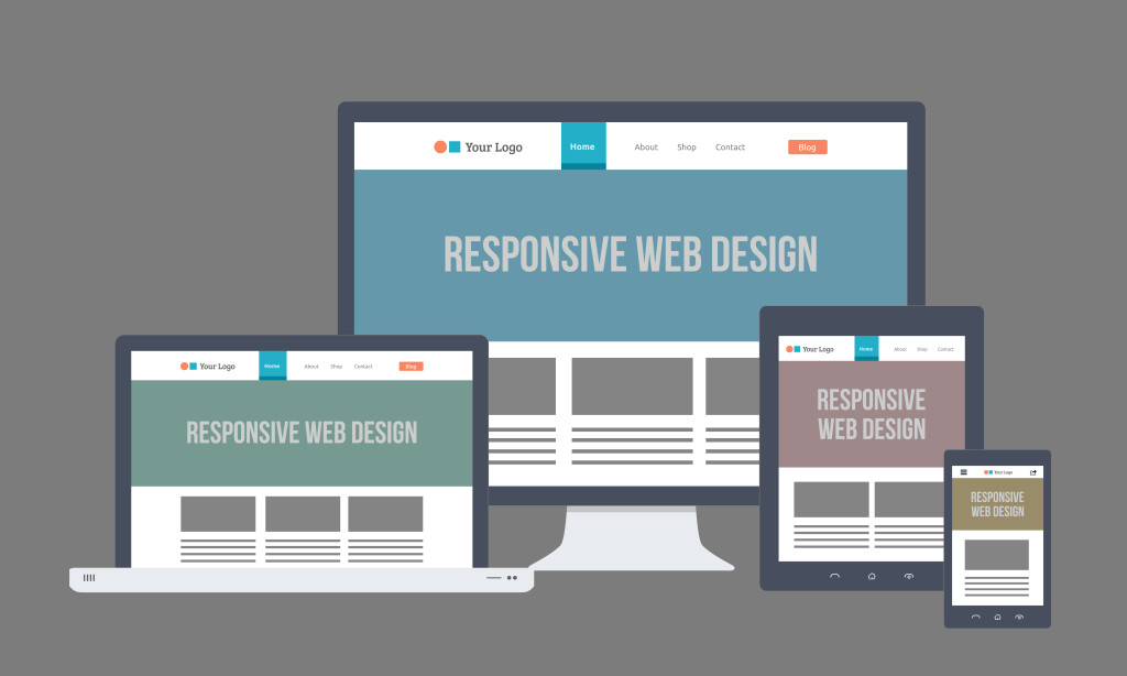
One of the main goals of responsive web design is that it adapts your site to different screen sizes using only a set of code. The core content, features and logic of your site will remain the same across every device.
Don’t worry about the text size or buttons as they will adapt and change according to the device that the user is using.
It offers huge valuable benefits for you and your users. As a website owner, you can easily serve your customer’s need across any platform while you eliminate the need of having separate sites for mobile and tablet devices.
However, your responsive web design for your e-commerce site must seriously take into consideration how it’s implemented. Make sure that all essential details about your product and features are provided above the mobile fold.
Almost e-retailers are experiencing significant increase in their mobile traffic and conversion rates. Their bounce rate has also dropped.
Responsive Web Design for E-Commerce Approved by Google
Google is now using responsive web design as a factor in ranking your website in search results. As an online seller, you’ll have the opportunity to scale into thousands of orders each day. Plus, you can track your potential clients every day. It allows your business to grow and survive amidst tight competition.
When you shift to a responsive design for your e-commerce, the results can be overwhelming. Your site will experience increased views and reduced bounce rates, as long as you post quality content, videos and images.
But you should consider adding a “save to cart” button to your responsive site. In this way, your potential customers won’t have to use their desktop to save some items in their cart and go back to their mobile device.
This is also your opportunity to stay ahead of the competition. As mentioned earlier, not all e-commerce websites have responsive web design. Use it to your advantage and stay ahead of the curve.
Are you planning to transform your site into a responsive web design for your e-commerce website? Take a look at our services or browse through our clients’ responsive e-commerce sites here: