Professional Web Design Trends to Follow in 2022

Does it feel like your web design has gotten stale? Do you feel like your site isn’t as great as it used to be? These may seem like small, nagging concerns, but the truth is that they’re real ones. Your website isn’t static. It’s not built of stone, set in place for decades to come. Obviously, your website should be updated often, in terms of new content, blogs, videos, landing pages, podcasts, and more. However, you may want to update your web design, too.
Web design, like anything else that involves art or business (and web design involves both) isn’t stagnant. It’s always changing. Expert web designers take that into account, incorporating what’s new and hot and combining them with proven, established fundamentals. Below are some of the professional web design trends that we’ve noticed already in 2022.
A Big Face You Can Trust
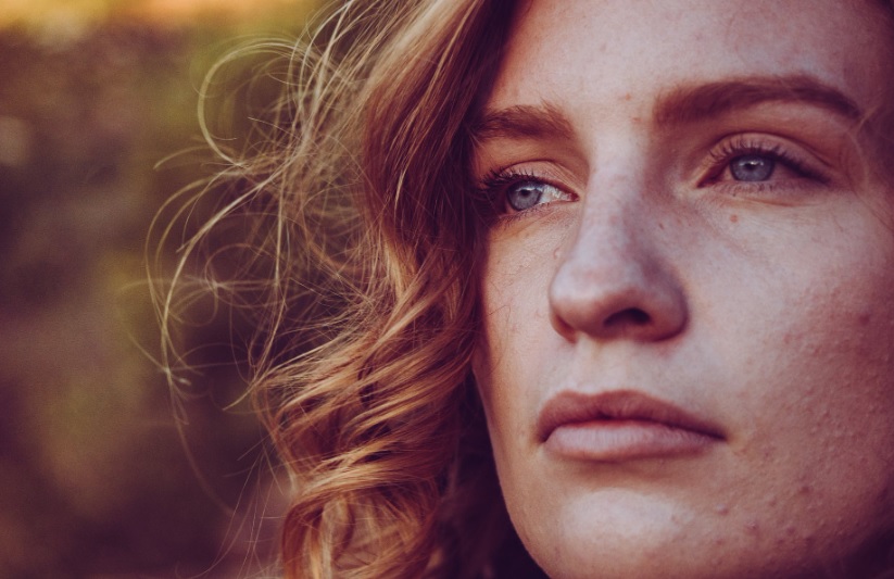
One of the most common trends you might see right now on websites are “big” faces, meaning close-ups, tight shots of faces, faces that are large enough to fill the screen (and bigger). These are popular for many reasons. They can establish a human connection, of course, you see a friendly (or even physically attractive) face and want to know more. “Virtual eye contact” may not sound like a real thing, but the connection it makes can be real indeed.
Beyond that, many web designers are returning to this again because, well, they can. In the last two years, many companies have shied away from showing close-ups of faces on sites. Why? Many reasons. Masks, and whether to have them on or off, for one thing. Should people be shown alone, surrounded by others, or…? No matter where you fall on answering those questions, the truth is that right now, you don’t have to ask them. Thus, big faces are in.
This isn’t to say that you need to put a giant close-up of yourself, your CEO, or a model or two on your homepage. That’s not going to be a good idea for every business, obviously. But, if you’re unsure what to do or how to do it, going with a larger face on your site can be a viable and fashionable thing to do right now.
Big Everything
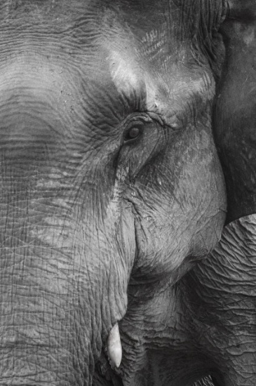
It’s not just big faces that are in right now, big “everything” is. That could mean close-ups of your products, your goods, services that you might offer, and more. This is done for simple reasons: it’s interesting. It’s eye-catching. You’re seeing something you’ve seen before in a whole new way: bigger and closer up. In a real way, this provides more information than a shot from further away might convey.
It’s also important to note that this isn’t limited to pictures, to static shots. For example, take a client of ours, Belal Hamideh Law. What’s the first thing you notice when you open that site? Sure, it might be the thing in the middle-top of the page, mentioning how “your accident has disrupted your life” and so forth. However, it’s more likely that your attention was captured by that large video behind it. Now, those aren’t a lot of close-ups of those people, but that sure is a big image. Several of them, in fact.
Whether you’re looking at it on your phone or your computer, that takes up much of your screen. That’s another thing to keep in mind about what’s “big” – you want it to be optimized for mobile devices, like everything else with your site. For something to be “big,” it doesn’t necessarily have to be a close-up, rather, it should be “big” when someone views it, whether they do so on their phone, computer, tablet, or other device.
Don’t Forget the Small Pictures
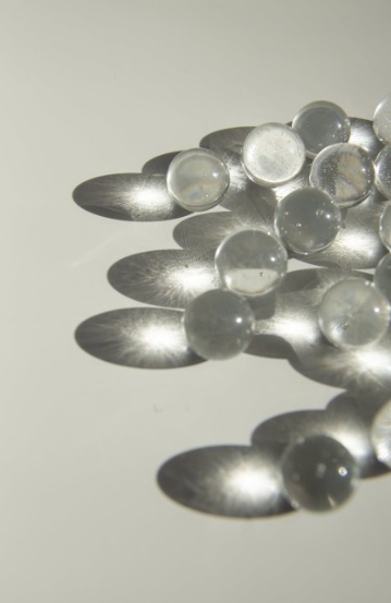
That said, it’s not like the only images on your site should be enormous ones. Many companies have also found with their web design that they’re well-served by having several “small” images as well. You may, for example, want to “mix it up,” by having plenty of small images all around your site, as a contrast to the larger ones.
To go back to the example of our client Belal Hamideh Law, look at each of the awards that he’s won, the Top 40 Under 40, the Avvo rankings, and so forth. Those aren’t nearly as large as the big video, of course, but they’re prominent. You don’t miss them. To make them any bigger, however, might come off as “bragging” or even “desperate.” They’re the right size for many reasons.
Professional Web Design in Los Angeles
The above are just some of the trends that are in right now. There are plenty of others. Here at Website Depot, our web design experts can make sure that your website is always in fashion, no matter what. Moreover, even once we’ve designed your site, we can make sure that it looks and functions exactly how you want. Of course, we offer more than just web design. As an omnichannel, full-service digital marketing agency, we can help with SEO, content, and so much more.
For a free consultation with our professional web design team to see how we can help, call (888) 477-9540.