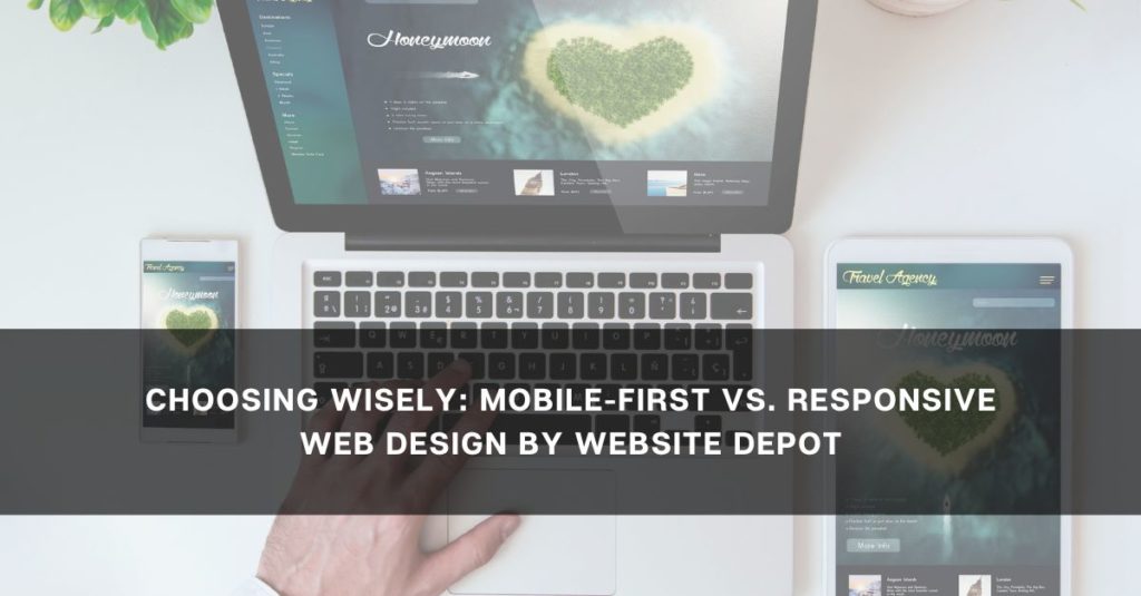
Choosing Wisely: Mobile-First vs. Responsive Web Design by Website Depot

In the ever-evolving realm of web design, the choice between mobile-first and responsive design is a critical decision that can significantly impact a website’s performance and user experience. At Website Depot, we understand the importance of this decision. In this article, we explore the distinctions between mobile-first and responsive web design, guiding you to make the right choice for your website.
Understanding Mobile-First Design
A Mobile-Centric Approach
Mobile-first design is exactly as it sounds – a design philosophy that prioritizes the mobile user experience. In this approach, the initial design and development efforts focus on creating a seamless and optimized experience for users on smaller screens, such as smartphones. The design is then progressively enhanced for larger screens like tablets and desktops.
Efficiency in Performance
One of the primary advantages of mobile-first design is its efficiency in terms of performance. By starting with a minimalistic approach tailored for smaller screens, websites often load faster on mobile devices. This is crucial in an era where mobile users expect quick access to information without compromising on user experience.
Google’s Mobile-First Indexing
With Google’s emphasis on mobile-first indexing, where the search engine primarily uses the mobile version of a site for ranking and indexing, adopting a mobile-first approach aligns with current SEO best practices. It ensures that your website is optimized for search engine visibility on mobile devices.
Responsive Web Design: A Holistic Approach
Flexibility Across Devices
Responsive web design, on the other hand, takes a holistic approach to accommodate a wide range of devices. It uses fluid grids, flexible images, and media queries to ensure that a website adapts and responds to different screen sizes, from small smartphones to large desktop monitors. Responsive design aims for a consistent user experience regardless of the device.
Adaptability to Emerging Devices
In a digital landscape where new devices constantly emerge, responsive design provides a level of adaptability that extends beyond traditional screens. From wearables to smart TVs, a responsive website is built to adapt to a diverse array of devices, ensuring longevity and future-proofing your online presence.
Unified Maintenance and Updates
A significant advantage of responsive web design is unified maintenance. With a single codebase that caters to all devices, updates and changes are applied universally. This streamlines the maintenance process, reducing the workload for developers and ensuring consistency across the entire user experience.
Making the Choice: Factors to Consider
Audience and User Behavior
Understanding your target audience and their browsing habits is paramount. If your audience predominantly accesses your website from mobile devices, a mobile-first approach might be more suitable. However, if usage is spread across various devices, responsive design could offer a more balanced solution.
Content Prioritization
Consider the nature of your content and how it should be prioritized across different screen sizes. Mobile-first design often requires a more strategic approach to content hierarchy, while responsive design allows for a more uniform presentation.
Development Resources and Timeline
Your available resources and timeline can influence the choice between mobile-first and responsive design. The mobile-first design may require more upfront planning, while the responsive design might be a quicker solution for websites that need to adapt rapidly.
The Hybrid Approach: Combining the Best of Both Worlds
Progressive Enhancement
For some websites, a hybrid approach that incorporates elements of both mobile-first and responsive design might be the ideal solution. Starting with a mobile-first foundation and progressively enhancing the design for larger screens can provide a balance between performance and adaptability.
Adaptive Images and Performance Optimization
Implementing adaptive image techniques and performance optimization strategies allows websites to achieve the best of both worlds. This hybrid approach ensures that users on various devices experience fast loading times without sacrificing the richness of content.
Navigating the Design Landscape with Website Depot
In the dynamic world of web design, the choice between mobile-first and responsive design depends on various factors. At Website Depot, we recognize that every website is unique, and the optimal solution may differ based on individual needs and goals.
Whether you opt for a mobile-first approach, a responsive design, or a hybrid solution, Website Depot is here to guide you. Our expertise in web design ensures that your website not only meets but exceeds the expectations of your audience, providing a seamless and engaging user experience across all devices.
Choose wisely with Website Depot, where your website’s success is our priority.
