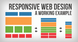
Call to Action Responsive Web Design

Google has continuously emphasized the importance of having a call to action responsive web design. Most consumers opt to use their smartphones or mobile devices to browse the Internet.
But just because you have a responsive web design doesn’t mean that you have an effective call to action button.
When you create the best CTA button for your responsive web design, make sure that it’s displayed perfectly.
Draw attention
The CTA button must draw your user’s attention. When you insert it along with your company’s logo, ensure that it’s 20% larger than your logo. But it must be larger than the surrounding elements.
If your page has multiple CTAs, ensure that the most important CTA should have a larger size.
The placement
In addition to the size, how you place the CTA button on your responsive web design is also critical. For most, it should be on the top section as it’s the most prominent location of a page. This can lead to higher landing page conversions.
Or you can place it in a distinguished area or at the center of your layout.
Whitespace
This is necessary so that the CTA button is detached from other elements. The whitespace is there to make the button stand out. It doesn’t require bigger space, but it must be sufficient enough to stand out among the adjacent elements.
Colors
When deciding what call to action button to use in your responsive web design, make sure that you use contrasting colors. Relative to the surrounding elements and its background, the CTA button must have a high contrast.
For instance, when the surrounding elements are black, your CTA button must be bright blue. The color choice of your CTA is important to easily catch your user’s attention.
Alternative actions
In some cases, having more than one CTA is necessary to convince a user to take an action. If you need more than one call to action button, make sure that it’s beside the primary button.
Sense of urgency
Use a phrase that will effectively convince your users to take immediate action or they’re going to miss an opportunity. You may use a phrase of Intro Price beside the Buy Now button, for example, to let your user know that if he/she waits, he/she is going to pay more later on.
You should also tell the users what to expect when they click the CTA.
If you’d like to learn more about how to create better call to action for your responsive web design, please call us up through toll-free number: 855-605-7361