Bootstrap – World’s Most Popular Mobile First Responsive Design
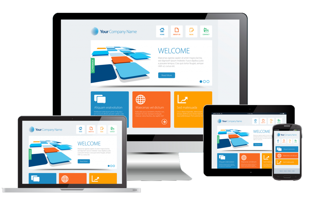
Bootstrap is still the world’s most popular framework that designers use to build a responsive design. Responsive design has become a must-have, rather than being just a good-to-have. As more and more people are opening and browsing the web trough their mobile devices, it just makes sense to make your site mobile-friendly. This framework is an excellent choice if you want to build a mobile app or responsive mobile design from scratch. It has enough customization tools. This means that responsive websites powered by Bootstrap don’t look like they’re Bootstrap-powered sites. With that in mind, you can choose how your site will function and appear. It has grid system and helpful components already made in advance. It also comes with JavaScript effects and extremely customizable Bootstrap CSS.Designers can easily start small with Bootstrap. If your site looks good when viewed on a small screen, you can easily scale it up without cluttering things. Mobile design is supposed to be counterintuitive. And this framework reinforces that. In this way, all Bootstrap sites will stay clean and logical if they’re viewed on smallest screens.This is possible because Bootstrap forces designers to build their sites with having small screens in mind. The key here is its grid-based layout approach. With it, you can use up to 12 columns. You can combine them and organize in layout classes.
Easy to use
One of the best things about Bootstrap is that it’s fast and very easy to use. Developers without in-depth knowledge about HTML or CSS can easily build their front-ends.It’s also flexible, even if the site you’re designing is a static HTML, a PHP-coded site or a CMS. Apart from that, you can easily download it allowing you to get your job done quickly.
What can you do with it?
There are a lot of things that you can do with this framework. You can create transition effects, dashboards, progress bars, drop-down menus, and so on and so forth. There’s a variety of Bootstrap design templates that you can choose from. They include forms, navigation styles, buttons, tables, and more.Plus, it’s compatible with major browsers, like Firefox, IE 8, Safari, Opera, and Chrome. Some of its features will be degraded to work on older browsers, however. And if you have a WordPress site, you can have its version designed for sites using WP.
Website Depot specializes in responsive design which is also essentials for your website’s SEO. To know more about Bootstrap and to help you out on how to use this world’s most popular mobile first responsive design framework, give us a call at 877-654-9736.